The Tattoo Studio Experience
The experience of placing something permanent on your body should be pleasant, inviting and collaborative.
Leaving you feeling comfortable in your own skin. Literally.
Long gone are the days where tattoo studios were only associated with heavy metal music, dark walls and intimidating bikers.
The industry is trying to evolve in providing a cozy, customized tattoo experience.
Service Design Case Study
The Problem
The perception of tattoo studios as scary, intimidating and unprofessional, particularly to new clients.
Goal
Eliminate the feelings of fear and intimidation associated with experiencing getting tattooed.
The Solution
Focus on the service to provide a feel-good experience that helps alter negative perspectives. Since an artist’s specific style and artwork is what initially speaks to their clientele, the art is not the issue. We knew the main goal needed to focus on the client experience surrounding the process of getting a tattoo.
Key takeaways about typical client tattoo experiences:
Feeling judged upon walking in unless they were covered in tattoos
Not asking the artist to make changes for fear of receiving a negative response or upsetting them
Not included in the tattoo design process
Overall lack of communication with either the artist or the studio
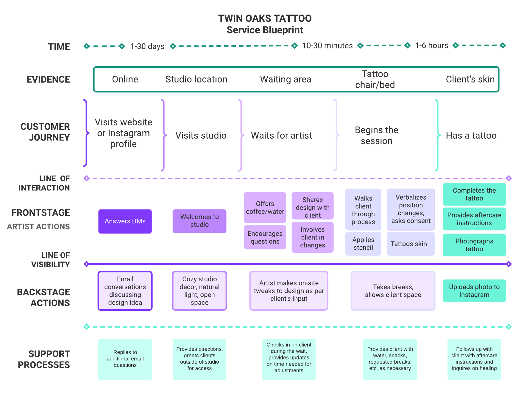
Check out the service
blueprint below.
This was used as a dependable framework to guarantee a client was happy with their tattoo experience.
Studio Aesthetic: Natural Lighting is Everything
-

The Entry & Waiting Area
Once the client enters, they see a warm, bright and airy space, similar to a lofty apartment. This adds a certain charm to the nerves they may be feeling while making their trip to the studio…especially as a first-time client not knowing what to expect.
-

The Tattoo Station
The artist’s space should be no different. Decluttered. Minimal décor. And of course, plants to continue the flow of the space.
End goal, the client should feel happy and at home, even where the “pain” happens.
-

Sweat the Details
Little touches make all the difference. While they’re in the waiting area, clients notice these things, comment on them, and take photos to share on social media. All of this adds up to their overall experience, which they carry a permanent keepsake of on their bodies.
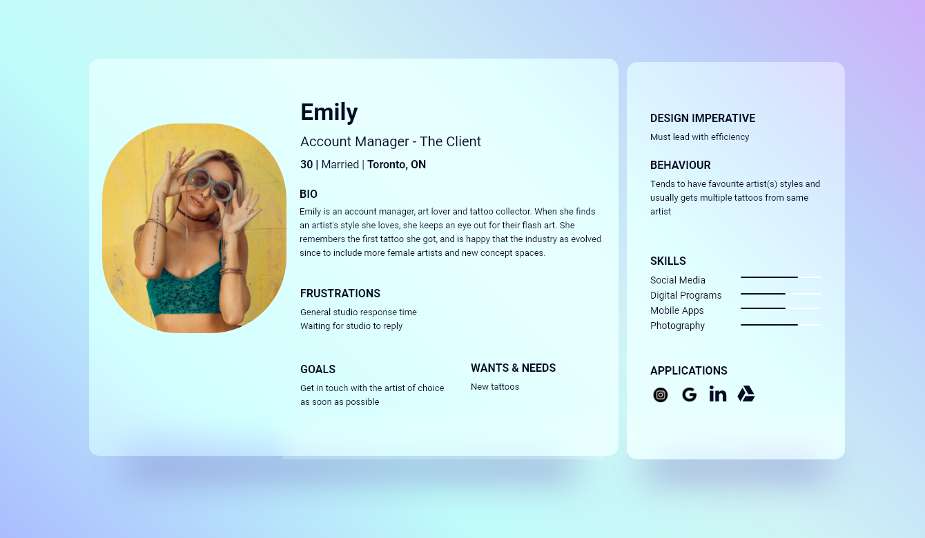
The Client User Persona
She knows the ways of the old and new in the industry and has a preference for the latter.
- Key Considerations -
Design
CONSIDERATION
IInline with keeping the client experience in the centre eye of the studio’s business goals, the website needed to tie in seamlessly with the physical space design.
Simple sans serif typography across entire website so that information is easily accessible and legible.
Keep buttons and styling to a basic minimum.
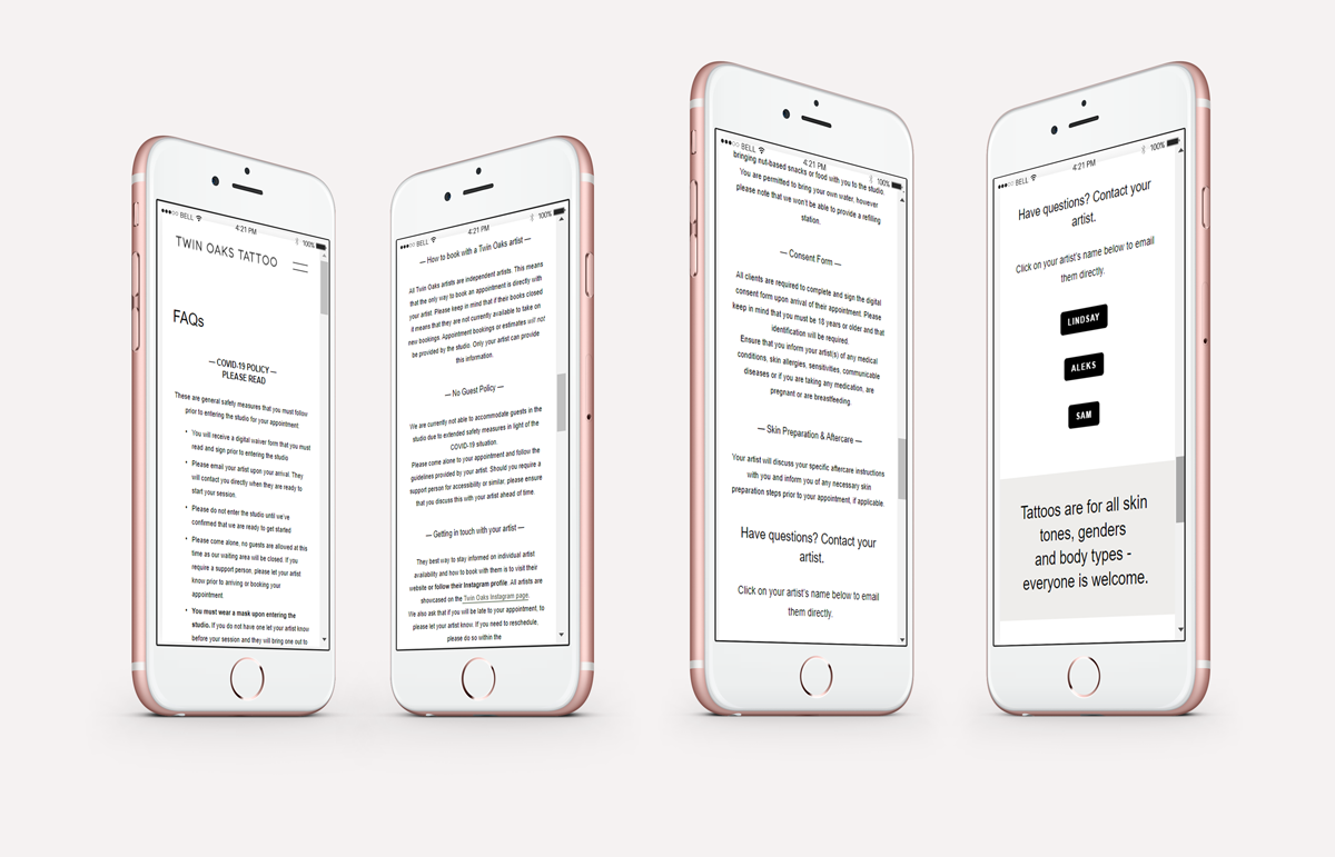
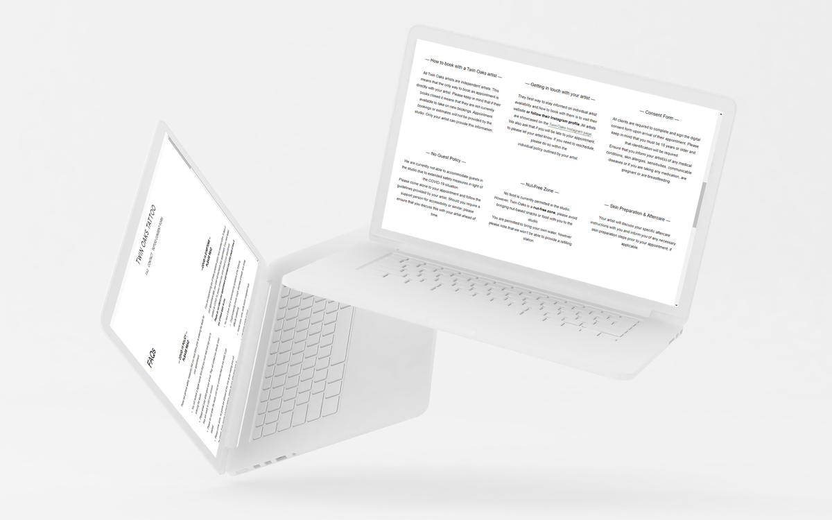
Consent Forms
CONSIDERATION
Considering their importance, these documents need to be available for prospective and new clients to view, along with current clients that will be signing these forms upon arrival for their session.
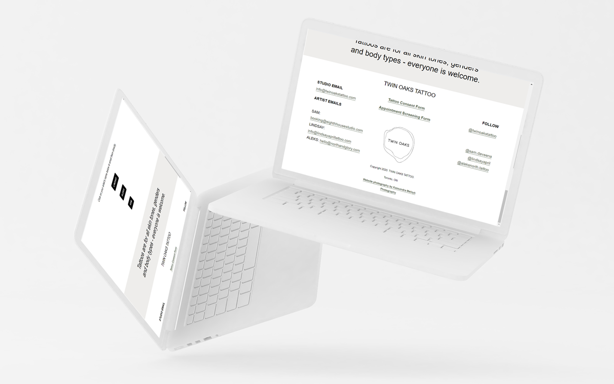
Add TATTOO CONSENT FORM option in the menu navigation.
Provide links to forms in the footer so that they are accessible on every page.
Artists
CONSIDERATION
If it’s a private studio, each artist manages their own clients and bookings.
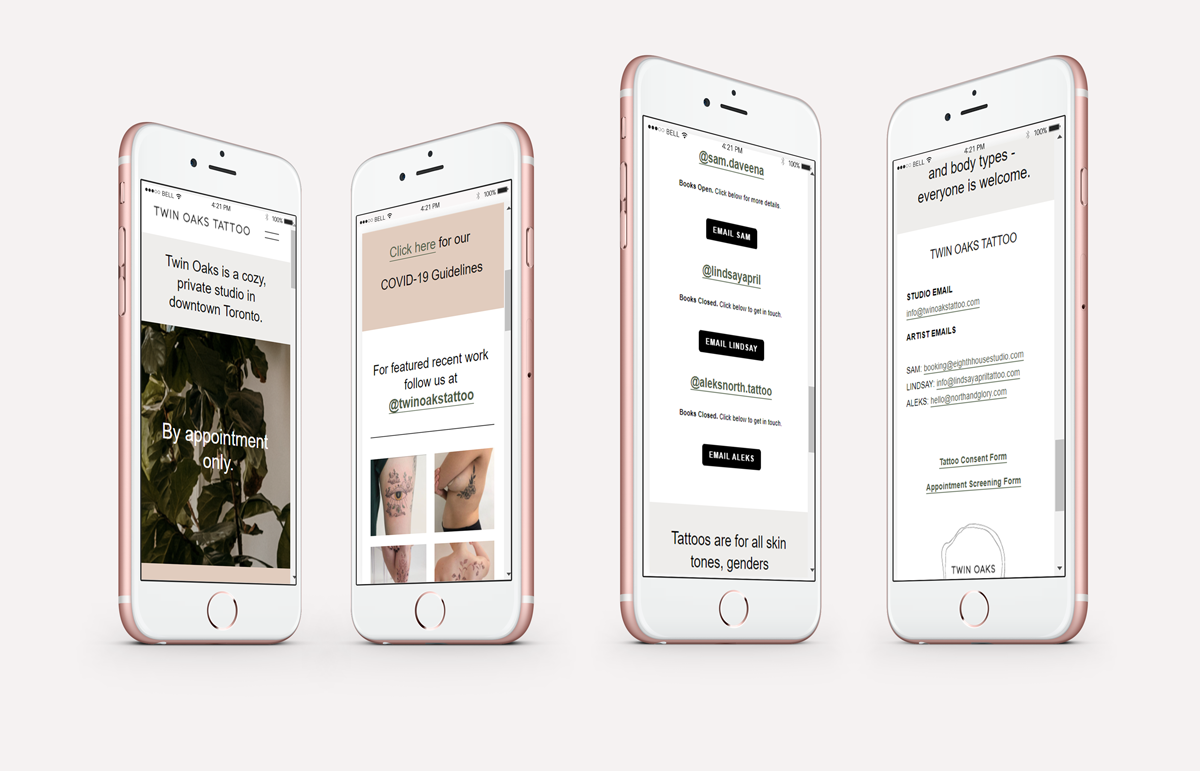
All contact avenues needed to lead back to the individual artist.
Provide buttons with direct links to artist emails across multiple pages.
Clients treat Pinterest, TikTok and Instagram as search engines for their next artist and tattoo idea.
Prior to supplying a deposit fee the booking process should be streamlined and easy to follow.
Once a deposit has been paid, everything should be digitally available yet not overwhelming leading up to the tattoo session.
Easily accessible consent & waiver forms
Prominently available, yet not overwhelming FAQ content
Matching physical studio aesthetic
Large, prominent images
Clear, legible text
Easy to find contact information
Tattoo Studio Website Example
Wireframe scroll of the homepage
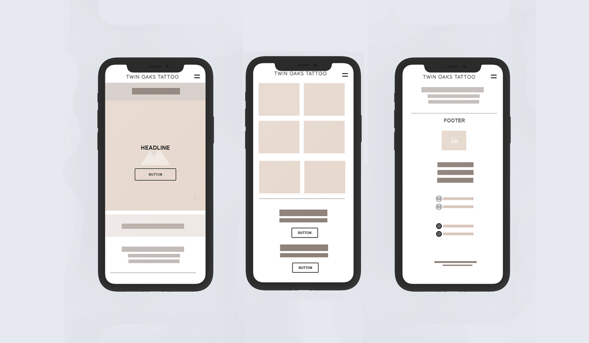
Takeaways for an easy-to-navigate digital space
Create dynamic balance in content hierarchy
Use footer space so that forms are easily accessible from any page
Grid design for large content sections, such as FAQs, to avoid lengthy information appearances
Sans serif type for clean, minimal, balanced aesthetic and information hierarchy