Visible Majority
Website Design & UX Strategy
— Overview
Visible Majority was started to add support to the social justice movement, to help people to see each other as neighbours and to recognize those doing good for humankind. Their apparel is a way to raise awareness around visibility and representation.
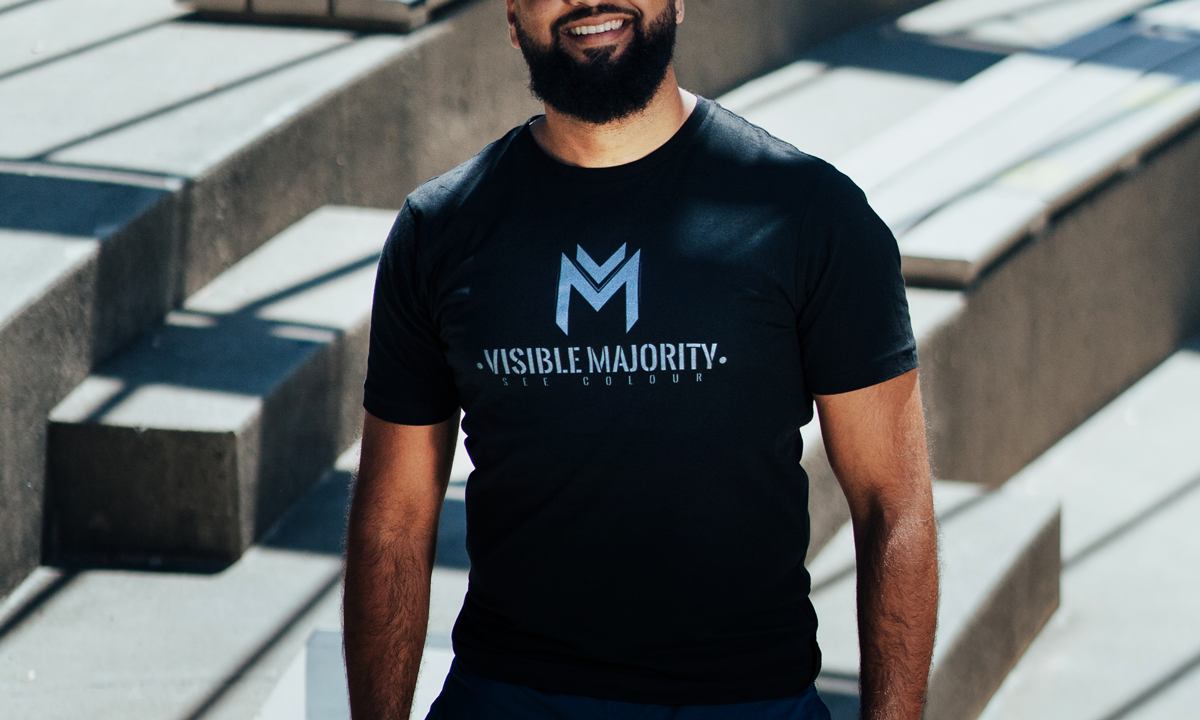
They are an apparel brand that produces well-designed products for those that want to signal their commitment to equity, and look good while doing so.
-
Web Designer & User Experience Consultant
-
Visible Majority co-founders & myself
-
Website design & user experience consulting
March - July 2022
Disclaimer: Website updates and maintenance not done by me.
57%
45%
40%
48%
40%
57% 45% 40% 48% 40%
The percentage of Canadians who experienced racism in 2021.
57% Black Canadians | 45% Indigenous | 40% Chinese | 48% South Asian | 40% East or Southeast Asian
Research sourced by Visible Majority
Personas
These personas helped us determine how to navigate the balance between content strategy and product strategy. Considering the brand apparel as a driving force behind Visible Majority’s message and what they stand for, it was imperative that not only the shirts themselves reflect this, but also how the apparel, as a product, was positioned from a marketing standpoint.
Selling the apparel was a main goal, however it was not the focal point. When users first lay eyes on the homepage, our goal was to establish a connection with the user that helps establish VM as synonymous with the social justice movement.
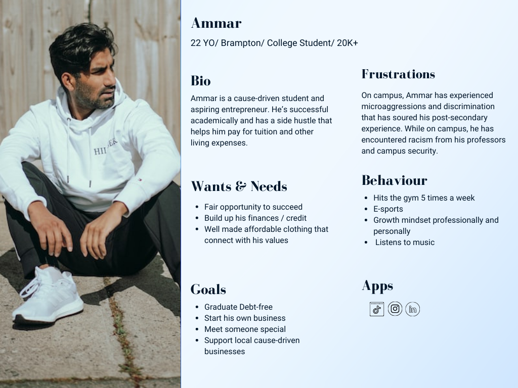
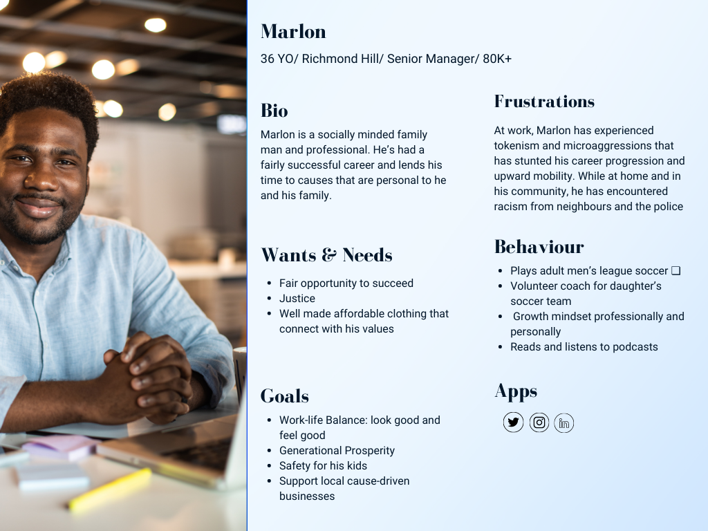
Persona research sourced by Visible Majority.
User Journey Map
Life experiences of encounters with racism.
— DISCOVER
Motivation to talk about their experiences and make an impactful difference.
— LEARN
Find a way to represent themselves and others to initiate change.
— SEARCH
Wear brand apparel with a logo that becomes a known symbol.
— USE
Engage with community members & those of shared experiences. Become an advocate for VM.
— GOAL
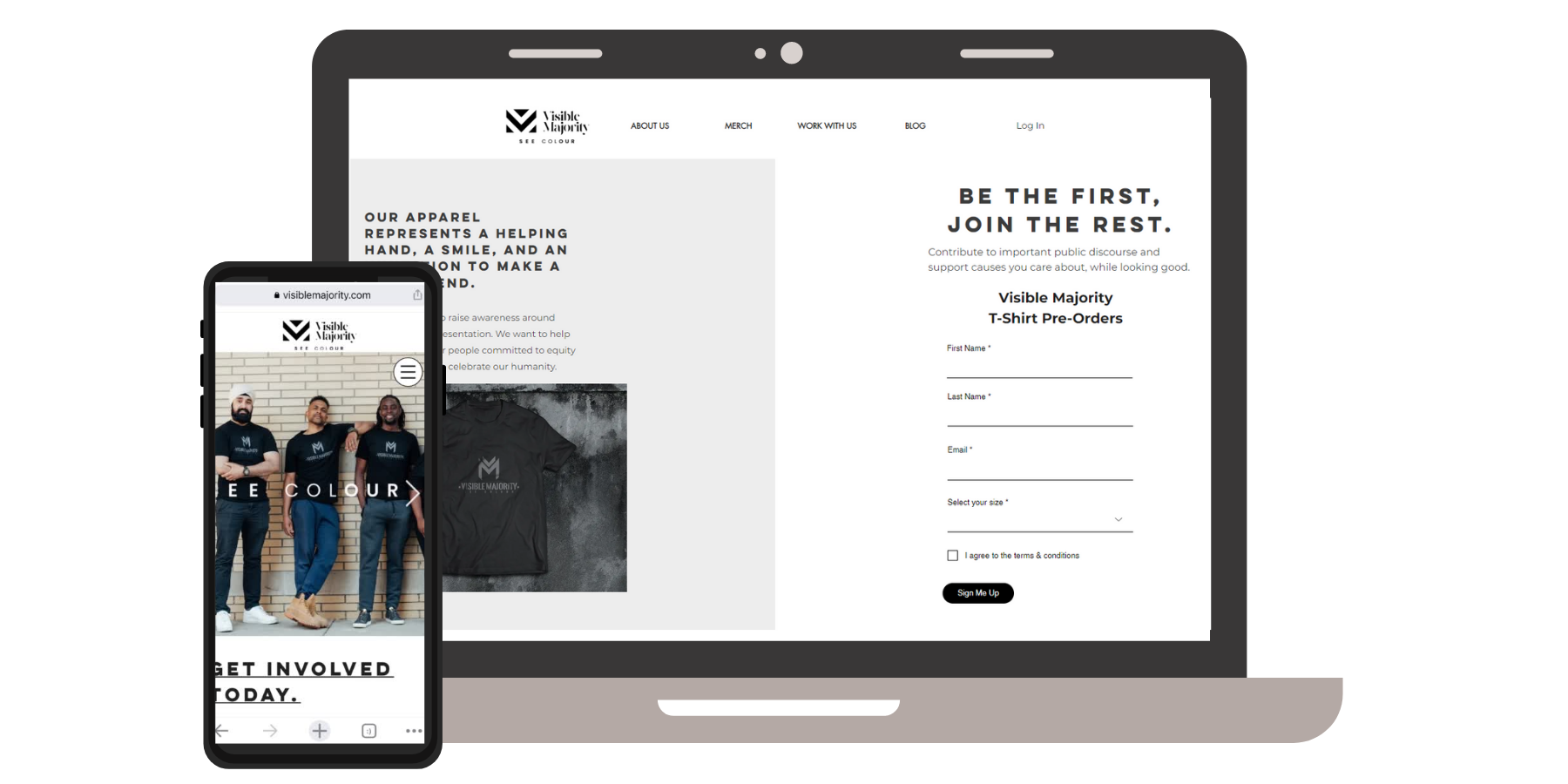
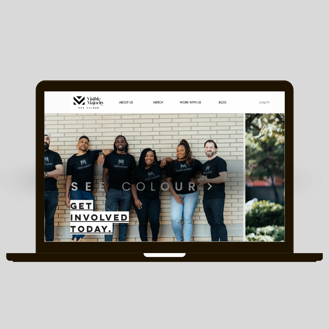
UX Strategy
& Website Design
Considering we had multiple goals at hand, the experience strategy behind the website framework was none other than to
keep it simple.
Balancing the copy with photos of real people wearing Visible Majority apparel, the dynamic between the written and the visual expressions should feel natural and effortless.
*Disclaimer: Clients are responsible for website maintenance. Certain details may not reflect North & Glory’s original designs.
Information Architecture
Create an engaging, relatable experience through content and hierarchy
Clear and concise copy, focusing on actionable words
Evoking emotionally relatable impact through imagery
Product Focus
Create a landing page for t-shirt pre-orders that users can be directed to from Instagram
Having a tangible element to help convey the message and generate proceeds dedicated to helping future generations
Experience & Function
Set up a template that allows client to access & update the backend easily
Must account for future content additions to include user stories
Visual Design
Black, white and grey palette to emphasize message of “SEE COLOUR” and protect the focus of words - allows opportunity for use of accent colour.
Goals
Engage community in public discourse regarding racism and engage members as storytellers of their own experiences
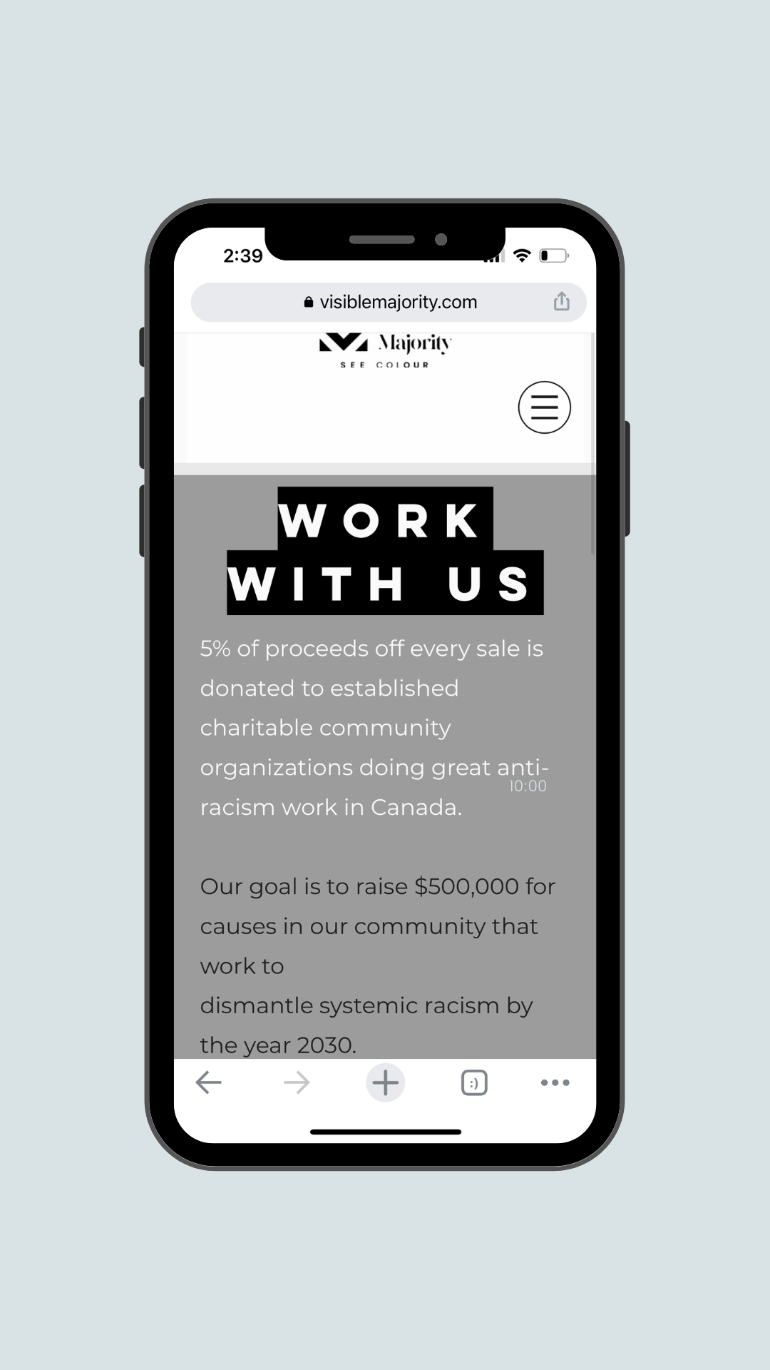
Grow the recognition of Visible Majority’s logo by selling wearable merch that becomes identifiable with their cause.
Build partnerships with aligned brands to help further drive the message home and induce social change.
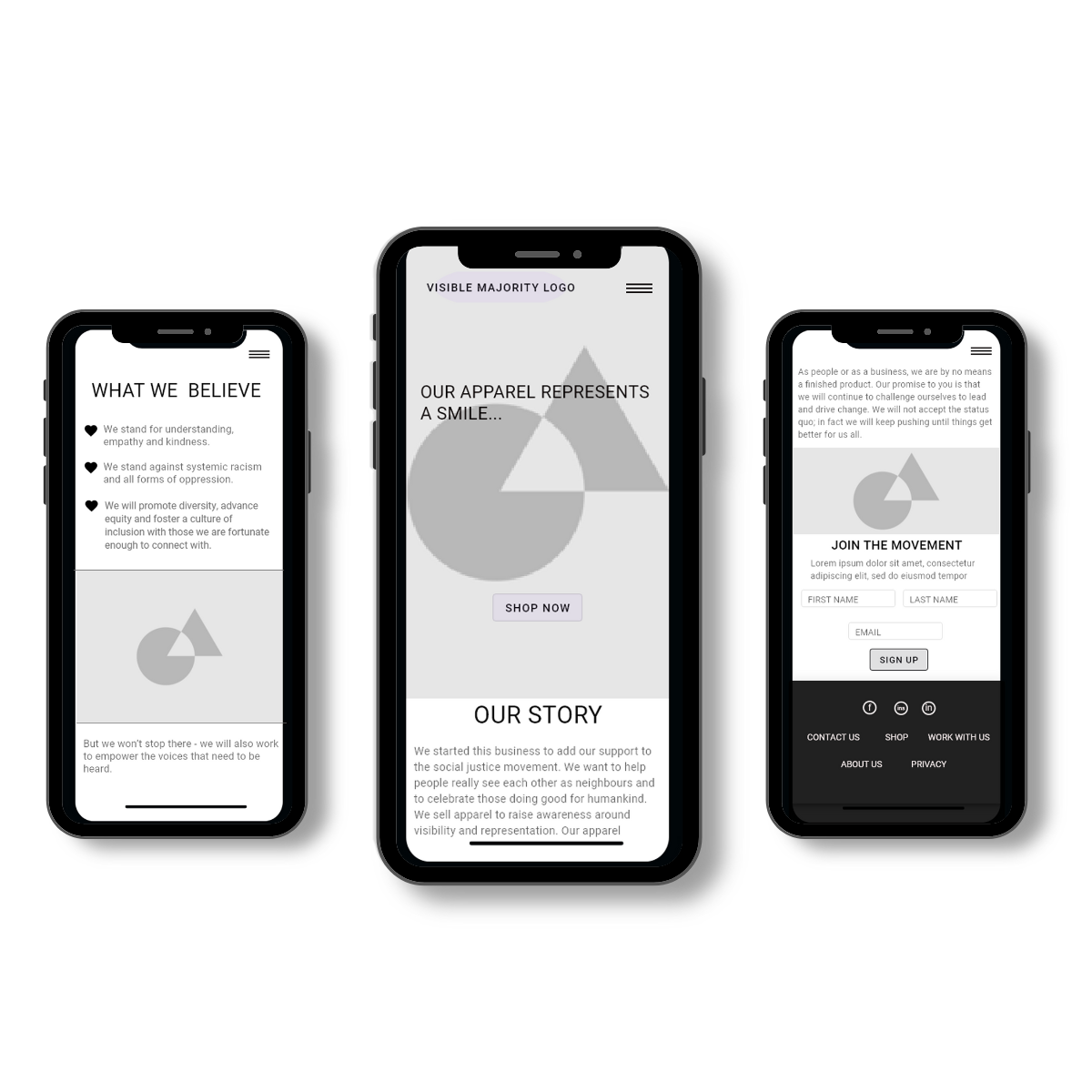
WIREFRAMING
Based on user and market research provided by Visible Majority, wireframes were developed to set the baseline for a minimal, mobile-friendly website that would be easy to edit via WIX, as the organization grows and its goals expand.